
 Standardized Design of Electronic Procedures
Home
First steps
First steps
What is DINTEL?
Designers
Developers
Resources
Frequently Asked Questions
Foundations
Foundations
Color
Typography
Box shadow
Spacing
Grid
Border
Border radius
Iconography
Illustrations
Animations
Accessibility
Design tokens
Writing guidelines
Data visualization
Interface elements
Interface elements
Modules
Templates
Components
Updates
Contact
Standardized Design of Electronic Procedures
Home
First steps
First steps
What is DINTEL?
Designers
Developers
Resources
Frequently Asked Questions
Foundations
Foundations
Color
Typography
Box shadow
Spacing
Grid
Border
Border radius
Iconography
Illustrations
Animations
Accessibility
Design tokens
Writing guidelines
Data visualization
Interface elements
Interface elements
Modules
Templates
Components
Updates
Contact
First steps
What is DINTEL?
What is DINTEL?
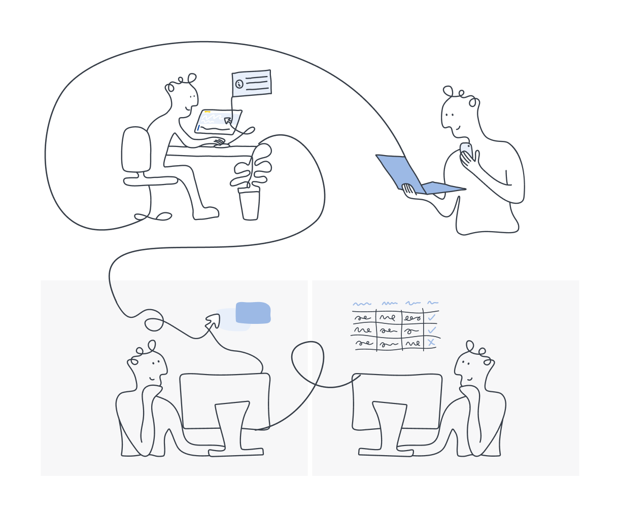
DINTEL is the Design System created for the Design Office of the General Secretariat for Digital Administration (SGAD) based on a modular, flexible, scalable, accessible and inclusive system.
DINTEL stands for Standardized Design for Electronic Processing. We created an interface with a common graphical line for AGE electronic services and information portals.
A system with basics, interface elements, components and design patterns that will guide designers and developers in the construction and/or adaptation of digital products and services easily and quickly.
A new model that facilitates and reinforces the digital skills of the city.
In the Design Office developers and designers support the needs of the electronic services that make up DINTEL.
Principles
Citizenship is the center of any procedure with the Administration. We work with principles that we share designers and developers.
We design for and with everyone
Interfaces created with the DINTEL Design System must be understandable, accessible and inclusive.
What we contribute
A library of reusable elements guided by clear documentation.
We design for the long term
The design system has to be flexible and stay alive in the long run. A design system is not static, but dynamic. It evolves with the product and its design.
We work together
For digital product teams it is imperative to think about a global digital ecosystem, coordinate and support each other.
Let's inspire confidence
Citizens must navigate safely through the sites and products we offer.
We collect and use data
Our projects must leverage data to learn from our users and improve their experience.
Components
Here you will find our collection of reusable elements at all levels to speed up your work and make your designs as consistent as possible.
The components cover a variety of interface needs, including:
Visualization: for the placement and organization of content, using components such as cards, lists and pages.
Navigation: allows users to move around the product using components such as breadcrumbs, steps and navigation tabs.
Actions: to allow users to perform tasks using components such as the action button.
Inputs: Allowing users to enter key information and messages through components such as notifications, modal or dialog boxes.
Communication: alert users to key information and messages through components such as notifications, modals or dialog boxes.
Each of our components is accompanied by usage guidelines that help to understand their meaning, implementation and good uses.
Components gallery

Theming
DINTEL facilitates the customization of its fundamentals and design tokens to generate new visual themes in those cases where a brand needs to give its website its own entity in color. To control the theming and the coherence of the system, you can only theme the entire primary color palette or with the label "interactive" in the token name or in the Figma style.
Origin
The first version of DINTEL was born in April 2023, and is regularly exposed to revisions and updates for a constant improvement of the system.
Updates
This website uses own and third party cookies to provide a better service. If you continue browsing we consider that you accept its use.


